The Situation:
I was the creative lead in a major branding and identity redesign for Limeade. The company was transitioning from scrappy start-up to a sleek and solid technology company in the health and wellness industry; the brand needed to transition to reflect that.
The Strategy:
In order to align with the marketspace, Limeade needed a brand that was trustworthy and professional while still being friendly and enjoyable to engage with. This brand would need to click with both HR professionals looking for company wellness programs as well as their employees, the end-users.
The Solution:
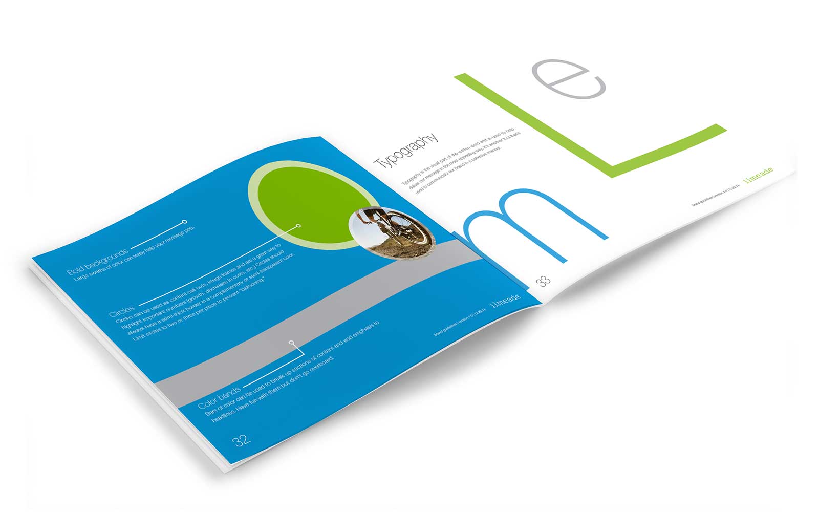
Collaborating with a small team of key contributors, the Limeade brand was transformed. A simple and clean typeface was chosen to replace its more-childlike predecessor and the sans-serif was used to keep the brand from tipping too far "corporate." Coupling the new font with bright colors and a conversational and knowledgable voice gave the Limeade brand that balance it was looking for. The result is a more clearly defined and industry aligned brand with a content-heavy guideline book outlining all visual, written, and graphic elements that make Limeade unique.
 in the beautiful Pacific Northwest